The Significance of Shadows and Architectural Symbolism: The Godfather
Francis Ford Coppola’s 1972 masterpiece, The Godfather, raised the bar for all films that preceded it for its brilliant character development, screenplay, intricate plot, and every shot of the film looks like an oil painting resembling the works of Rembrandt, DaVinci, Caravaggio, and Vermeer. The Godfather is a film with some of the most striking lighting and cinematography ever created on the silver screen. Cinematographer Gordon Willis is able to portray every actor, prop, and setting on screen with such craft and distinctive Rococo style that elevates the storytelling and brings the audience in deeper. Willis’ genius use of architectural symbolism and shadows further our understanding of the Corleone family in ways that have never been done before in cinematic history.
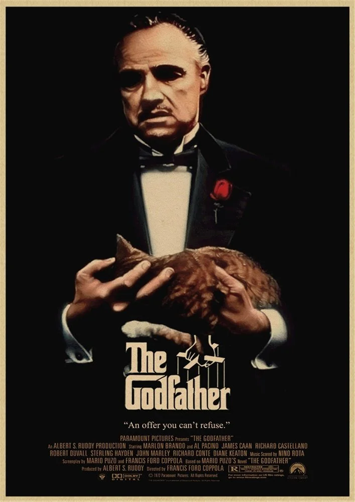
Willis' use of Light versus Dark highlights the thematic plot elements of good versus evil. Micheal Corleone is a character who is frequently appearing in different lighting styles, making the audience further understand his world of duality. The Corleones live in a world of complex, concrete rules, thus giving the film plenty of chiaroscuri, shadowy shots, and hard lines, specifically on the character’s faces. This choice in lighting is precedent in the film’s first shot. The characters are pictured in a darkly lit room, emphasizing their shadowy eye sockets. Leaving the eyes dark shows how twisted the morals are of these individuals because eyes are considered the windows to one’s soul.
All the characters are lit differently, and Micheal’s lighting changes because he is the character who undergoes the most change in the film. Some characters in the movie are lit from the side or from above, only illuminating a selective part of their face. This style of lighting can be achieved by removing fill lights. By showing only one lit part of the face, the shadows reinforce that every character has a dark and unknown side. Tom is frequently lit from the side to emphasize that he lives half his life as a lawyer and half as a criminal. Don Vito To emphasize his prosthetic makeup, Don Vito is also shown being lit from above to provide minimal eye light to further display his mysteriousness; we never know what choice he will make, which is why the audience never fully sees his eyes until his death, when he is in total exposure. Sonny is always well-lit because of his brash nature and because he operates too much out in the open, unlike the mysterious Micheal and Don Vito.
The deliberate underexposure in the color movie is a modern and stylish choice. The last time that deliberate underexposure was used as a cinematic choice was during the German Expressionist movements and film noirs shot in black and white. During the 70s, most movies had a bright veneer, and The Godfather stands out amongst films of this decade for its diversion from what was popular at the time.
Besides just lighting on characters, Willis places much visual emphasis on the emotional symbolism of architectural props, notably windows, doors, and chairs. Windows divide the public from the private. As a periphery, windows are delicate and porous, and they are an almost too-easy target for bullets and eavesdropping. Throughout the film, windows operate as a way for the audience to see the world through a character’s eyes. It is a net where the character projects their thoughts to the audience.
Doors are used patriarchically throughout The Godfather because they physically and emotionally separate women from men. Almost the entirety of the doors seen in the film are within homes and separate the men on the business side from the females on the family side. Doors are closed to women when men discuss business matters, and women are seen knocking and asking for permission to open locked doors.
The ultimate symbol of the film is that of the chair, representing isolation, power, and status. Chairs in the movie are used similarly to a king’s throne; this is most easily recognized when family members kiss the Godfather’s hand as he sits in his chair while the others stand. Not only do chairs assert dominance, but they are also places where characters contemplate decisions.
The collaboration between director Francis Ford Coppola and cinematographer Gordon Willis created one of the most visually stunning pieces of cinema ever produced. Willis’ intense lighting needed to be directed with such caution because one mistaken movement and a character would be in complete darkness. Willis’ masterful visuals mimic that of a renaissance painting that neither distracts nor subtracts from the immaculate screenplay; it only enhances it.


